MOJ
eISSN: 2574-8130


Mini Review Volume 10 Issue 3
Great Zimbabwe University Department of Bio Medical Science
Correspondence: Kufakwanguzvarova Wilbert Pomerai, Faculty of Medicine, University of Zimbabwe, Zimbabwe
Received: July 04, 2025 | Published: August 13, 2025
Citation: Pomerai KW, Gundindza MB. Application of pareto chart as a simple effective quality improvement tool in reduction of maternal deaths in health care settings. A case review. MOJ Gerontol Ger. 2025;10(3):69‒70 DOI: 10.15406/mojgg.2025.10.00342
Quality improvement is mentioned frequently as a strategy to reduce and prevent maternal deaths as well improving safety of mothers in line with safe motherhood initiative. Several tools are applied in quality improvement, however for easy dissection of the problem and measurement of effectiveness of interventions the Pareto Chart is the easiest, and also fastest tool to asses maternal health problems and check effectiveness of counter measures. In addition to its application, health workers must adhere to standardized protocols and checklists for essential obstetric care. These protocols, availability of resources, combined with regular audits and feedback, can help ensure consistent, high-quality care during labour, delivery, and postpartum periods. Pareto chat application is underutilised and reported. The aim of this manual is to equip Health workers in maternity departments and maternal health programmers with skills to utilise the Pareto chart for improved maternal health outcomes in line with universal health coverage and sustainable development goals. In conclusion the application of the Pareto chat and other tools are effective in reduction of maternal deaths and achieving the Sustainable Development Goals.
Key words: quality improvement, safety, safe motherhood, pareto chart, maternal deaths
The World Health organisation (WHO) defines maternal death as the death of a woman while pregnant or within 42 days of the end of the pregnancy, irrespective of the duration and the site of the pregnancy, from any cause related to or aggravated by the pregnancy or its management, but not from accidental or incidental causes.’1 The WHO reported that maternal deaths occurred almost every two minutes globally in 2020.
Maternal mortality remains a significant global health challenge, particularly in low resourese settings. Identifying and addressing the primary causes of maternal deaths is crucial for improving healthcare outcomes.
The Pareto Chart is a fundamental quality improvement tool, it helps health care workers prioritise interventions by identifying the most critical factors contributing to maternal deaths.2
An Italian economist Vilfredo Pareto developed this quality tool, hence it was named Pareto Chart after him. He demonstrated that 80% of wealth in his town was owned by 20% of the people hence the 80/20 rule. The Pareto Principle, also known as the 80/20 rule, suggests that 80% of problems arise
from 20% of causes.3 The Pareto Chart is a visual tool that organizes data to highlight the most significant contributors to a problem. In healthcare, this tool enables professionals to focus on the most impactful factors affecting patient outcomes. There are many tools, techniques, diagrams, and charts that are used in quality management to make analysis and improve the process quality. Pareto Chart (also known as Pareto Analysis or Pareto Diagram) is one of the seven basic tools of quality which helps to determine the most frequent occurrences, complaints, or any other factor. It is a visual tool widely used by professionals to analyse data sets related to a specific problem or an issue. From this aspect, it can be used as an efficient tool for problem-solving.4
In this article, we will demonstrate how to make and read a Pareto chart by using a Pareto chart example for reduction of maternal deaths.
Typically, Pareto Chart involves vertical bars descending from left to right and a line that represents a cumulative curve. The bar that has the highest value falls into the far left and the bar that has the lowest value falls into the far right. The vertical axis on the left side represents the frequency of occurrence, costs or another measurement related to the survey. The vertical axis on the right side represents the cumulative percentages of the values shown in the left vertical axis.4
The First and longest bar is named the critical contributing factor, the second one is the very important, the third is called the important, the following called the less important and the last the trivial or less important. Ideally by tackling the critical and very important the magnitude of deaths is reduced. A good example will be used below.
Below is a diagrammatic reflection of contributing factors, Please note the first three contributes 80% and are the ones to be tackled as mentioned above. Extracted from https://www.projectcubicle.com/ (Figure 1).
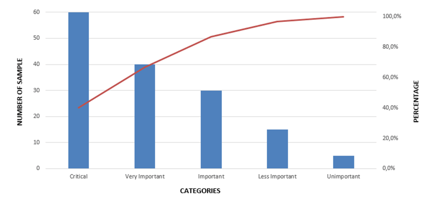
Figure 1
Critical could be haemorrhage, very important eclampsia, important sepsis, less important diabetes etc by tacking critical, very important and important we would have reduced maternal deaths significantly. This is because the 80% mark is among these three.
The Pareto chart is believed to follow the power law. In statistics, a power law is a functional relationship between two quantities, where a relative change in one quantity results in a relative change in the other quantity proportional to the change raised to a constant exponent One quantity varies as a power of another. The change is independent of the initial size of those quantities.
For instance, the area of a square has a power law relationship with the length of its side, since if the length is doubled, the area is multiplied by 2, while if the length is tripled, the area is multiplied by 3, and so on.
Pareto Charts are used to analyse a data set to understand the frequency of occurrence of a problem in the case maternal deaths. Sometimes there may be more than one cause for the problem/maternal deaths and you use this tool to determine the most important one. For example postpartum haemorrhage eclampsia, etc
Below are the steps for creating a pareto charts
The most important class or category is represented by the biggest bar which is on the left. The least important category is symbolized by the smallest bar which is on the right. In other words, the bars on the left are more important than the bars on the right.
There is a cumulative percentage line in The Pareto Chart which helps to analyse the effect of each category. The slope of the cumulative percentage line changes based on the importance of each category.
If a Pareto effect exists, the cumulative line rises steeply for the first few contributing factors and then levels off. If the bars are almost linear, it is easy to analyse the slope of the cumulative percentage line.
Identifying Key Causes of Maternal Death: Health care workers can make use of the Pareto chart to effectively analyse maternal mortality data and determine the leading causes of deaths like postpartum haemorrhage, eclampsia etc. By categorising and ranking the causes of mortality in order, it will be easy for the health workers to allocate resources equitably, and effectively to curb the deaths of the mothers.4
Prioritisation of interventions: once the most frequent causes are identified health care workers can implement targeted evidence based interventions such as improved care, timely access to emergencies and better infection prevention. Training pf health workers on management of the most frequent causes of deaths can be a good example of a cost effective intervention Monitoring and Continuous Improvement: Pareto charts help health workers track progress through indicators. This will ensure that the interventions are effective especially when applied in Kaizen it’s used to check effectiveness. Regular updates to the chart helps refine the strategies and adapt emerging challenges in maternal health care.
DataDriven Decision Making: Helps healthcare professionals make informed choices based on statistical analysis. This will reduce wastage of time resources and even skills of personnel in maternal health. If decisions are made based on subjective basis the effectiveness of the interventions will be wrong and no improvements will be realised. In addition those will make resource allocation better and ensure the ever limited resources are directed towards most impactful interventions. In the long run there will be better maternal comes in this case reduced maternal deaths
The Pareto Chart is a simple yet powerful tool for quality improvement in maternal healthcare. By identifying and addressing the most critical factors contributing to maternal deaths, healthcare facilities can implement targeted interventions that save lives. Continuous monitoring and adaptation ensure sustained improvements in maternal health outcomes. The Pareto chat must be applied together with other strategies and quality tools like fish bone, histograms, prioritisation matrix, tree diagram standard operating procedures, maternal death audits, trainings, supervision, availing resources, health promotion and other.
None.
No funding support has been taken from any organization.
No conflict of interest has been declared by the authors

©2025 Pomerai, et al. This is an open access article distributed under the terms of the, which permits unrestricted use, distribution, and build upon your work non-commercially.